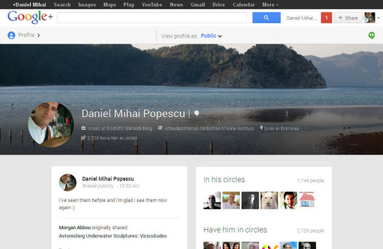
The improved design of the hottest “new” Social Media appendix at the moment, Google Plus, took me by a pleasant surprise. After a few seconds of contrariety, taking the tour and exploring it in depth for a good few minutes, I felt good. It’s sleek it is colored, it’s attractive, it offer a better perspective, I don’t have too many words to praise it. With it’s multi-column view and the possibility to renew the stream flow yourself, it definitively improved. I don’t believe anyone who follows over one thousand active accounts that they see them all. I think that they look only to a circle and communicate in that circle. Now, if you opt for your community members’ posts to not show in your public stream, you can see them all. Unfortunately, or what can I say, for a lot of people (especially in my streams), Google Plus is a whole day job, like Pinterest, or a few sites. One doesn’t have “real” time for the “job job” if stays on Google Plus as much as he/she likes.
[source]
Above is Fred Gilbert, lead designer for the new Google Plus, sitting at his desk with his sleek MacBookAir and his iPad. It’s what Guy Kawasaki once said, “a shame to have such good tools around and not using them, Google Plus is for Social Media what a MacBook is for laptops, the top”. I’m paraphrasing him, anyway that’s the sense of what he said. MacBook is the best laptop and Google Plus is the best Social Network.
“In an effort to deepen the user’s content experience, Google Plus stream now will automatically add hashtags to posts, so that users can browse related content by clicking on a post of a particular topic. By scanning posts and tagging it accordingly, Google Plus will identify and rank relevant conversations based the assigned hashtags.” – according to Google+ Blog.
You can remove automatically-added hashtags from posts at any time. It’s enough to watch the following video, to see how cool it looks.
The design of the new Google Plus is muted and flat. The colors are actually quite neutral, allowing mostly the content to shine brighter. “Flatter design keeps the distraction away,” Gilbert said. This new philosophy is reflected in this new version of Google+, which is marked by simplicity and fewer distractions. For instance, unless you are ready to engage with a piece of content, the links appear as regular text, without the distraction of the blue link. Both the left and right sidebar and menus disappear, sliding in and out as needed. – from gigaom.com (the link is at the source of Gilbert’s photo)
So, the main changes are for the moment: the multi-column layout (one, two, or three columns of content depending on your screen size and orientation), an “awesome-sized” media (photos and videos can fill the entire width of the stream, making it easier to scan, and nicer to look at), “delightful” animations (the sharebox bounces, the menus slide, and the cards flip and fade).
When you click on the related hashtag, the card flips and let you browse related content inline.
More of it, unexplored yet by myself, on Vic Gundotra’s post, on their blog.
If you liked what you read (and for that I humbly thank you for your patience), subscribe to this blog by Email! Follow this blog on Twitter, and on Facebook! For a joyous day, check out my pins on Pinterest or my grams on Instagram 😄. I hope you like this blog so much that you think it’s time to take a step further by becoming yourself a blogger; in order to do that have the kindness to read the Own Your Website offer I have prepared for you! You won’t regret. Thanks for passing by 😄 Speak your mind, don’t be shy!
Copyright © 2013 Rodolfo Grimaldi Blog – The New Face of Google Plus


