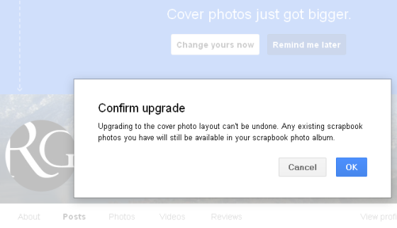
As if the coders are switching jobs between the two Social Media monsters, Google+ changed the “look” of your header profile, “cover photo” or whatever they call it. It is huge and covers a great part of your screen, especially if you use some more toolbars than usual. I’ve made already the mistake to accept the switching to the “new profile”, somehow in a hurry, not taking in consideration that it was irreversible. I thought that usually the changes are for your own good, Google being so much valuable comparing it with Facebook. In the hunt for users, they started again to copy each other. It’s useless, it is now obvious that Facebook users don’t see the point in anything, in any change their circus provider makes “for them” apparently, not the brands are going to repudiate it now because the “likes” so sweaty accumulated, are worthless, and the promotion costs real money, not monopoly money.
I don’t like to nag here and there (as I saw already) about how bad is a certain change made by Google, about what a futile instrument it is in matter of Social Media. It would be stupid. I remember that Facebook management was oriented to match any change made by their great challenger. Facebook tries to be all or it’ll crash. I feel that it’s still something artificial regarding money, but I have to admit the potential. As long as people don’t know to use it properly, Facebook still remains the most powerful manipulation tool on the planet. They changed the header in something grotesque, a chosen pic that fills the screen. I don’t care, since I don’t use it, but I do care when I see that my Google+ profile looks over the limit of the good taste with the pic from the scrapbook photos album (how wonderful it used to be), distilled to fill the borders at 900×500 pixels.
This is the picture I have uploaded after I saw what a mess they did with one from my scrapbook photos album.
The solution to make it less tall is easy. Unfortunately the header will never have the old look again. You can crop it, after you upload as “cover” a very high quality picture of your like. Very high quality just to look good, something of more than 1 Mb is very good, with some 16:9 aspect ratio and which must be at least 480 x 270 pixels, up to 2120 x 1192 pixels, like the one I had replaced, after a few attempts of choosing from my old ones in the scrapbook photos album.
So, the step by step actions are as follows:
- Go to your profile.
- Click on “change cover”.
- Upload a new pic of good quality.
- Click “save”.
- Click on your “cover photo”.
- In the upper left corner of the screen, you have the option to edit the photo. Click on “edit”.
- After that, on the editing screen, select “crop”.
- Drag the corners of the cropping lines how you feel suited, but keep the wideness whole, for a better look after.
- Click “save” on the upper right!
- Wait!
- Click to confirm “replace photo”.
- Wait again
- Click to “Apply crop”.
- Wait for changes to take place.
- Get out of the photo editing screen, click on the “x” in the upper right!
- You are now on your profile page, but only that huge photo is visible. Refresh the page!
- That’s all. If you want to delete the photo, instead of “edit” choose to click on the bin icon. The cover will be the thin one from default, only you can’t reverse the profile header style to five small squares as it was before.
Now, my header looks like this one:
It’s 900×260 pixels on the G+ profile.
The other change they did is connected with Google Reader, but I’ll speak my mind on a separate post.
If you liked what you read (and for that I humbly thank you for your patience), subscribe to this blog by Email! Follow this blog on Twitter, and on Facebook! For a joyous day, check out my pins on Pinterest or my grams on Instagram 😄. I hope you like this blog so much that you think it’s time to take a step further by becoming yourself a blogger; in order to do that have the kindness to read the Own Your Website offer I have prepared for you! You won’t regret. Thanks for passing by 😄 Speak your mind, don’t be shy!
Copyright © 2013 Rodolfo Grimaldi Blog – Re-size the Header in Your Google Plus Profile


Thanks Daniel. It works! I’ve got a nice header for my new Google+ page. Here is the proof: https://plus.google.com/103776681952688678183 Now everything starts to get some sense.
So it seems, congratulations :).